Eric Joyce, Marketing Specialist
@ericmjoyce
As data collection has proliferated within the classroom and across industry, those responsible for discerning meaning from data are faced with a challenging task – cutting through the noise. Data visualization tools allow these individuals to synthesize and interpret complex data in new and innovative ways, analyzing key data trends to gain a deeper understanding of the statistical insights the data provide.
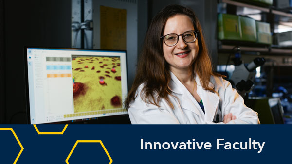
Eejain Huang, a Data Visualization Fellow with the Digital Education and Innovation Lab (DEIL), is applying her background as a Ph.D. candidate working on a combined program in education and psychology as well as a masters degree in statistics to explore this exciting new field and its impact on the 21st century educational landscape. As a Student Fellow, she is contributing to the larger mission of Academic Innovation to create a culture of innovation that enables personalized, engaged and lifelong learning for the University of Michigan community and learners around the world. Eejain works directly with the DEIL team on a project designed to compile and organize student survey data from Massive Open Online Courses (MOOCs). She synthesizes this raw data using data visualization tools to create an interactive dashboard for faculty to explore learner feedback and understand the demographic composition of their students.

Eejain shared how she has applied her educational experiences to her fellowship and ways in which data visualization provides insight from student responses and self-reported demographic information into academic initiatives at U-M.
What past educational experiences motivated you to pursue your work in data visualization with the Digital Education and Innovation Lab (DEIL)?
I come from a very diverse research background: developmental psychology, educational psychology, statistics and graphic design. I’m currently a Ph.d. candidate in the Combined Program in Education and Psychology and a prospective master’s student in the Department of Statistics. I’m also a freelance graphic designer and illustrator in my rare spare time.
Two factors strongly motivated me to pursue the data visualization work in DEIL. First, my strong research interest in investigating how visual elements – such as visual perspective, imagery and visualization process – augment or impair learning processes and learning outcomes. Secondly, my personal interest in accurately and aesthetically conveying information through graphics.
What new skills have you developed during your fellowship and how do you feel these skills help you create additional impact within the data visualization field?
My technical skills such as managing large data sets with R and Python definitely have grown during this summer fellowship. But I would argue, more importantly, I gained the ability to think critically about the role of visualizations. We have taken simple plots (bar chart, line graph, scatter plot, etc.) for granted without thinking of the situations in which they might not work, such as over plotting in a scatter plot. This also reminded me that each data set is unique and has special restrictions, that’s why we need to be mindful of what kind of visualizations are most compelling yet honest for the current data. Data visualization is just another way of communicating our findings to the audience. It can be extremely compelling and interesting, but it should not reflect or indicate something that’s not in our data.
How will the projects you are working on help provide data-driven insights for faculty?
With the astronomical amount of data we gather through online surveys and MOOC websites, it’s beyond human ability to grasp the useful information hidden in the mass of data points. Visualization serves as a summarization, guidance, metaphor and eventually a gateway to understanding the data. Like the old proverb says, “sometimes a picture is worth a thousand words.”
My project aims at creating a carefully structured interactive dashboard with different forms of visualizations grouped together to tell a story about a certain MOOC course. Through this dashboard, the faculty will be able to understand who their students are, what they need most and what they are expecting from the course. This dashboard will serve as a starting point and guidance for enhancing our MOOC courses.
Any advice for faculty or students looking to visualize and interpret data in new ways?
There are always different interpretations regarding the data and results. We can’t be entirely objective with our graphs, but at least we should always be mindful of the possibilities of other interpretations and representations.
The Digital Education and Learning Lab (DEIL) works with U-M faculty and staff to act as a hub for innovators on campus. By experimenting with new pedagogies and technologies, creating new models and challenging assumptions, DEIL helps these innovators develop and grow successful initiatives to transform education.
Interested in helping shape the future of learning? The Digital Education and Learning Lab (DEIL) will soon accept applications for new fellows specializing in copyright, accessibility, foreign language translation, data analysis and instructional design. Look for these positions on the DEIL page in the coming months.