Rebecca Quintana, Learning Experience Designer
@rebquintana
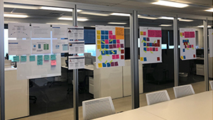
Visitors to the Office of Academic Innovation often comment on the notations and diagrams that cover our whiteboards and glass surfaces, or remark on our liberal use of colorful Sticky Notes that are clustered on walls and tables (see Figure 1). Clearly, a lot of creative work happens in our space, and many ideas are captured, improved on, and synthesized using a variety of materials. In this two-part series, I will explore how Academic Innovation project teams have experimented with various representational forms as we develop curricula for Massive Open Online Courses (MOOCs). In Part I, I will detail our use of low-fidelity representations to storyboard course design during the design phase, using three recent examples. In Part 2, I will share work that we have been doing in the academic research and development space, and describe our experimentation with two representational formats with the goal of understanding their potential utility for reflecting on design after a MOOC has launched.
Design challenges
MOOCs can be structurally complex, because they contain a wide range of activities and resources that can be arranged in various curriculum sequences. Course elements can communicate instructional content, such as videos, links to external resources, and static pages of text and images. We also use course elements to provide opportunities for learners to interact with content and other learners, using machine-graded quizzes, peer-graded assignments, special widgets, and discussion forums. Once a course is “live,” learners can get a sense of the layout of a course by navigating through its elements, using a menu of icons and textual links.
However, during the design process, project teams may have difficulty grasping the overall shape of a course—including the sequence and arrangements of various course elements—without an aid or tool. In the absence of a bird’s eye view, it can be difficult to comprehend (1) if course elements are mapping to learning goals, (2) if challenge and effort are distributed evenly throughout the course, and (3) if content and activities are varied in ways that are engaging for learners.
Introducing design representations
The scholarly work from the emerging field of learning design is a useful resource, because it considers how learning activities—tasks that learners engage in, in order to make progress on, and meet, learning goals—can be codified and made available for review and critique. Visual representations of curriculum design can be used as a shared referent in the form of design representations. Researchers like Grainne Conole from the University of Leicester have examined the utility of a variety of representational formats, such as mind maps, models, and diagrams, which can bring particular pedagogical dimensions into focus. For instance, Conole explains the “swim-lanes” format is a useful diagram for depicting activity levels that the curriculum designer anticipates will take place (Conole, 2010).
Drawing on the field of learning design, we have used large-format visual representations with course design teams to support and stimulate thinking about curriculum design. We have experimented with different representational formats, all of which essentially portray an abstraction of course elements and sequences. Since the big picture can be particularly hard to grasp at the “fuzzy front end” of the design process (i.e., when project teams are still making decisions about how instruction should be organized and sequenced in the online environment), we have tested using design representations as a mediational tool during design conversations. We found that during design meetings with faculty partners it can be helpful to focus on a shared referent—which can be used to stimulate conversations about target audiences and learning goals—to test ideas about content and activity structure, and to evaluate whether or not the current design gives learners sufficient opportunities to make progress and demonstrate that they have met learning goals. Next, we detail an approach that we have been piloting—using low-fidelity materials to storyboard curriculum design. The idea is that by using low-fidelity materials (e.g., Sticky Notes), design teams can get an “at a glance” view of the current state of a curriculum design, while feeling free to add and subtract elements, and move things around.
Design representations in practice at Academic Innovation
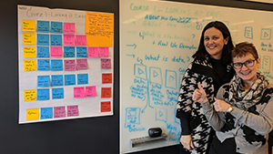
In this first example, we created a curriculum storyboard with a team that is developing a series of MOOCs about statistics. The design team is large and includes Dr. Brenda Gunderson, the lead faculty innovator; professors, staff, and graduate students from the College of Literature Science and the Arts (LSA); faculty from the Consulting for Statistics, Computing, and Analytics Research group (CSCAR); a design manager; and a learning experience designer. The design team had jointly contributed to a spreadsheet that listed learning goals, possible topic areas, and possible data sets. During a “check-in” meeting, the design manager, learning experience designer, and lead faculty member worked through a process of translating the information contained within the spreadsheet to a curriculum storyboard (see Figure 2). We developed a system for representing the curriculum plan, using colored sticky notes and icons to represent each element type (e.g., a blue sticky note with an arrow stood for a lecture video). In a subsequent design meeting, the entire design team discussed the storyboard and made adjustments to the flow by adding and rearranging sticky notes.
In a second example, we created a curriculum storyboard for Dr. Katie Richards-Schuster, the lead faculty innovator who is developing the Social Welfare Policies and Services course, the final MOOC in the School of Social Work’s MicroMasters program (see Figure 3). The learning goals, instructional content, activities, and assessments for the course were already well-defined, but before moving into the production phase, the design team wanted to ensure the design made sense in terms of curriculum sequencing (e.g., building on foundational concepts introduced earlier in the course), workload balancing (e.g., creating a regular cadence for learner engagement), and personalized learning (e.g., providing learners with opportunities to investigate topics of personal relevance).
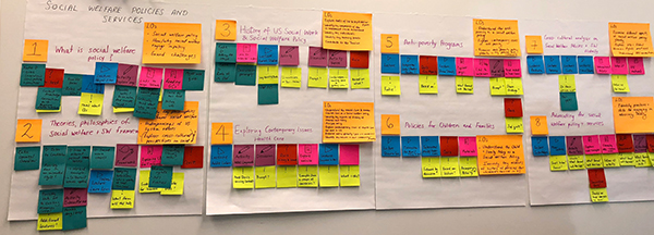
“I found the process very helpful to ‘see’ the course and its elements. The colored sticky notes also helped as I was conceptualizing types of activities and assignments,” Dr. Katie Richards-Schuster said. “I have continued to go back to these sheets (and pictures from them) as I have built out the course. They continue to help guide my ability to visualize the course and what I hope will be the learner’s experience with it.”
In a third example, we created a curriculum storyboard for use in design meetings that were held virtually (see Figure 4). Most of the design meetings for the Strategic Planning of Public Libraries MOOC were held online using video conferencing tools. Throughout the process, we used a variety of digital communication and coordination strategies, including email, shared documents, and spreadsheets to develop the curriculum for the course. As we were nearing the end of the design process, a learning experience designer and a student intern created a curriculum storyboard of the entire course (based on the digital documentation). We photographed the storyboard and sent the photos to the course’s instructor, Larry Neal, via email. In a subsequent design meeting, we discussed the design of the whole course, focusing on areas that were tagged “to think about” (the neon green Sticky Notes).
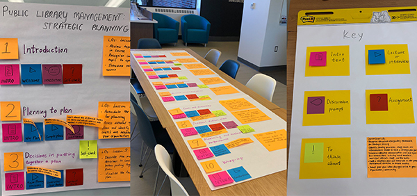
Jeff Bennett, Design Manager in the Office of Academic Innovation, said, “These colorful visualizations helped streamline a process, by making the course easier to understand for both myself and the faculty member, moving us forward at a critical moment in the design process.”
Neal said, “Working with a visual representation provided both a detailed and broad overview of the entire course. It also provided a simple model for collaboration and understanding the desired outcomes between the course instructor and the MOOC designers.”
As we continue to experiment with curriculum storyboarding in our design processes, we will continue to refine our methods toward a more nuanced understanding of how they work best and how they may be effectively used in the future.
Selected references
- Conole, G. (2010). An overview of design representations. In Proceedings of the 7th International Conference on Networked Learning (pp. 482-489).

